Why Some Fonts Look Different on Mac vs Windows
February 10, 2026
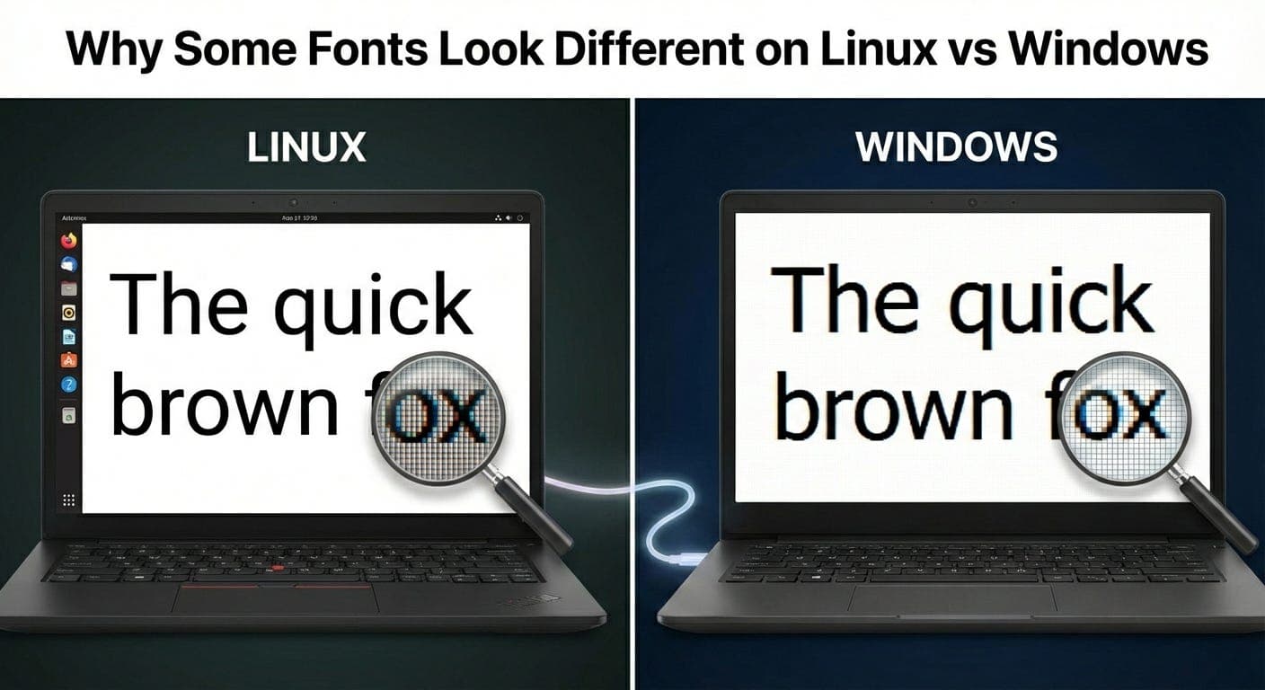
Designed a site on my Mac. Looked great. Opened it on a Windows laptop. Same fonts, completely different appearance. Thinner, sharper, kind of harsh.
Thought my CSS was broken. Nope. Just font rendering.
The Thing Nobody Warns You About
Fonts aren’t just fonts. How they appear depends on the operating system rendering them.
Same font file. Same browser. Different OS. Different look.
Took me way too long to realize this wasn’t a bug I could fix. It’s just how things work.
What I Saw
Built a site with a custom web font. Nice rounded sans-serif. Looked smooth and friendly on my MacBook.
Tested on a Windows machine at work. Same font looked thinner. Letters had harder edges. Less smooth. Almost harsh.
Same font weight. Same font file. Same browser (Chrome). Totally different appearance.
What?
Font Rendering Engines Are Different
macOS and Windows render fonts differently. Fundamentally different approaches.
macOS: Tries to preserve the design of the font. Smooths everything out. Prioritizes how the designer intended the font to look.
Windows: Tries to make text crisp and readable. Aligns text to pixel grid. Prioritizes clarity over design fidelity.
Neither is wrong. Just different philosophies.
macOS says “fonts should look like the designer intended.”
Windows says “fonts should be easy to read on screens.”
This affects every font on every site you build.
The Antialiasing Difference
-
macOS uses subpixel antialiasing and grayscale smoothing.
Pixels aren’t just on or off. They can be partially on, blended with background colors. Creates smooth curves. Fonts look softer, rounder. MacBooks with Retina displays have so many pixels that text always looks smooth. The high pixel density hides jagged edges. -
Windows uses ClearType.
Also does subpixel antialiasing, but differently. Uses the RGB subpixels in LCD screens to add extra detail. Makes text sharper but sometimes looks colored at the edges if you zoom in. ClearType aligns text to the pixel grid more aggressively. Fonts look thinner and crisper on Windows.
On lower DPI Windows monitors, this is actually better for readability. The pixel-aligned approach makes text clearer on lower resolution screens.
The Bolding Problem
This is where it gets weird.
Font weights look different too. font-weight: 400 (normal) on Mac looks similar to font-weight: 500 on Windows.
Designed a site with font-weight: 300 (light). Looked elegant on Mac. Opened it on Windows. Text was so thin it was hard to read. Almost invisible on some screens.
Had to adjust. Used font-weight: 400 on Windows, font-weight: 300 on Mac.
body {\n font-weight: 400;\n}\n\n@media (-webkit-min-device-pixel-ratio: 2) {\n /* High DPI screens, usually Mac */\n body {\n font-weight: 300;\n }\n}
Not perfect, but helped. Still annoyed me that I had to do this.
System Fonts Are Also Different
Every OS has default system fonts.
macOS: San Francisco (Helvetica Neue on older versions)
Windows: Segoe UI
Android: Roboto
Linux: Usually Liberation Sans or similar
If you use the system font stack:
font-family: -apple-system, BlinkMacSystemFont, "Segoe UI", Roboto, "Helvetica Neue", Arial, sans-serif;
Each OS shows a different font. They’re designed to look good on their respective platforms.
This is actually fine. Each OS gets the font that’s optimized for its rendering engine.
But it does mean your site looks slightly different everywhere.
Web Fonts Don’t Escape This
Thought using web fonts would solve it. Load the same font file everywhere, get consistent rendering, right?
Nope. The font file is the same. But the OS rendering engine still does its thing.
Loaded Roboto from Google Fonts. Looked smooth on Mac, thinner on Windows. Same font, different rendering.
Can’t escape it. Operating systems control how fonts render.
The Font Smoothing CSS Property
There’s a CSS property for this:
body {\n -webkit-font-smoothing: antialiased;\n -moz-osx-font-smoothing: grayscale;\n}
This forces grayscale antialiasing instead of subpixel rendering.
Makes fonts look slightly thinner and crisper on Mac. Closer to how they look on Windows.
Some designers love this. I used it for years. Then realized it makes text harder to read for some people, especially on non-Retina displays.
Now I’m more careful about using it. Only on headings or larger text where the aesthetic matters more than maximum readability.
For body text, let the OS do its default rendering. It’s optimized for that platform.
Light Text on Dark Backgrounds
This gets even weirder.
Light text on dark backgrounds looks thicker than dark text on light backgrounds. Something about how antialiasing works.
.dark-mode {\n background: #000;\n color: #fff;\n font-weight: 300; /* Needs to be thinner */\n}\n\n.light-mode {\n background: #fff;\n color: #000;\n font-weight: 400; /* Can be normal */\n}
On Mac, light text on dark backgrounds is almost too bold. Need to drop the font weight.
On Windows, it’s less pronounced but still noticeable.
Built a dark mode without adjusting for this. Text looked heavy and clunky. Reducing the font weight fixed it.
Testing Across Platforms
Can’t just design on one platform anymore. Need to check both.
I develop on Mac. But I have a cheap Windows laptop specifically for testing. Not even kidding. Cost like $300. Worth it for testing.
Virtual machines work too, but performance is meh. Real hardware is better.
Some things to check:
-
Body text at normal reading size
-
Headings and larger text
-
Light text on dark backgrounds
-
Thin font weights (300 and below)
-
Small text (12px or smaller)
If it looks good on both Mac and Windows, you’re probably fine. Linux and mobile will fall somewhere in between.
The Monitor Quality Factor
This matters more than people think.
Cheap Windows monitors with low pixel density? Text looks rough no matter what. High-end Windows monitors with good DPI? Text looks much better.
MacBooks have great screens. Makes everything look good. But not everyone has a great screen.
Your users are on all kinds of displays. Can’t design for just one.
What I Actually Do Now
-
Use standard font weights
font-weight: 400for body text. Maybe 600 or 700 for headings. Avoid ultra-light (300 and below) unless it’s large text. -
Test on both platforms
Check Mac and Windows. If it looks bad on one, adjust. -
Don’t use font-smoothing on body text
Let the OS handle it. They know their rendering engines better than I do. -
Use font-smoothing on large text if needed
Headings, hero text - sometimes antialiasing looks better there. -
Consider system fonts
They’re optimized for each platform. Look good everywhere. -
Avoid super thin fonts
Light weights (300 and below) can be hard to read on Windows, especially on lower DPI screens.
The System Font Approach
Honestly, this is the easiest solution:
font-family: system-ui, -apple-system, BlinkMacSystemFont, "Segoe UI", Roboto, sans-serif;
Each platform shows its native font. Optimized for that OS. No rendering issues because the font is designed for that rendering engine.
Your site won’t look identical everywhere. But it’ll look good everywhere. And that’s better.
The Performance Bonus
System fonts don’t need to be downloaded. Zero network requests. Instant rendering.
Web fonts add latency. Flash of unstyled text while fonts load. Extra KB to download.
System fonts skip all that. Just work.
Not always the right choice. If brand identity matters, use a web font. But for content-heavy sites, system fonts make sense.
The Variable Font Thing
Variable fonts are interesting here. One font file with multiple weights and styles.
@font-face {\n font-family: 'MyFont';\n src: url('myfont-variable.woff2') format('woff2-variations');\n font-weight: 100 900;\n}
But they still render differently on Mac vs Windows. Doesn’t solve the rendering engine difference.
Nice for reducing file size though. One variable font instead of multiple weight files.
What Actually Matters
Your site will look different on different platforms. Accept it.
Can’t make it pixel-perfect everywhere. Different rendering engines, different screens, different user settings.
Focus on:
-
Readable on both Mac and Windows
-
Not too thin or too heavy on either
-
Works at different sizes
-
Good contrast
Pixel-perfect consistency across platforms? Not possible. Good enough on all platforms? Totally doable.
The Honest Take
I used to obsess over this. Tried to make fonts look identical everywhere. Drove myself crazy.
Now I design on Mac, test on Windows, adjust if something looks bad, move on.
If body text is readable on both, that’s good enough. If headings look slightly different, that’s fine. Users don’t compare across platforms.
They just see your site on whatever device they have. As long as it looks good on their device, they’re happy.
Perfection is overrated. Good enough on all platforms beats perfect on one.
Quick Reference
-
Fonts look thinner on Windows than Mac:
Normal. Windows rendering is crisper. -
Light fonts are hard to read on Windows:
Use minimumfont-weight: 400for body text. -
Text looks too heavy on Mac:
Maybe you’re testing on Retina display. Check on lower DPI screen too. -
Want consistent rendering:
Use system fonts. Each platform gets its optimized font. -
Want custom fonts:
Test on both platforms. Adjust weights if needed. Accept slight differences.
Thanks for reading Under The Hood! Subscribe for free to receive new posts and support my work.